Play
Hyperlens
One of first augmented reality brandings — Hyperlens. From strategy and positioning of the innovative product to visual language, website and video that will help investors understand the essence and believe in the project.
Creative direction by Sergey Lavrinenko.
Motion-graphics by Andrey Jandarov and me.
Video editing by Ivan Gusarov.
Music by Yan Pavelchuk.
Web-design by me.
Made at ONY
With Hyperlens, reality becomes more interesting, brighter and more convenient. Using your smartphone, you can create and see a world that will transform ours. In it, artists can exhibit art objects and arrange galleries in any of the squares of the city. Alternative navigation appears in it, and your friends from social networks are displayed in the city.
We decided not to compete with reality in graphics — it is an impossible task for AR technology today. On contrary, we came up with the concept of Reality OS, a system with a blank language that creates maximum contrast with the detailed and complex world around.
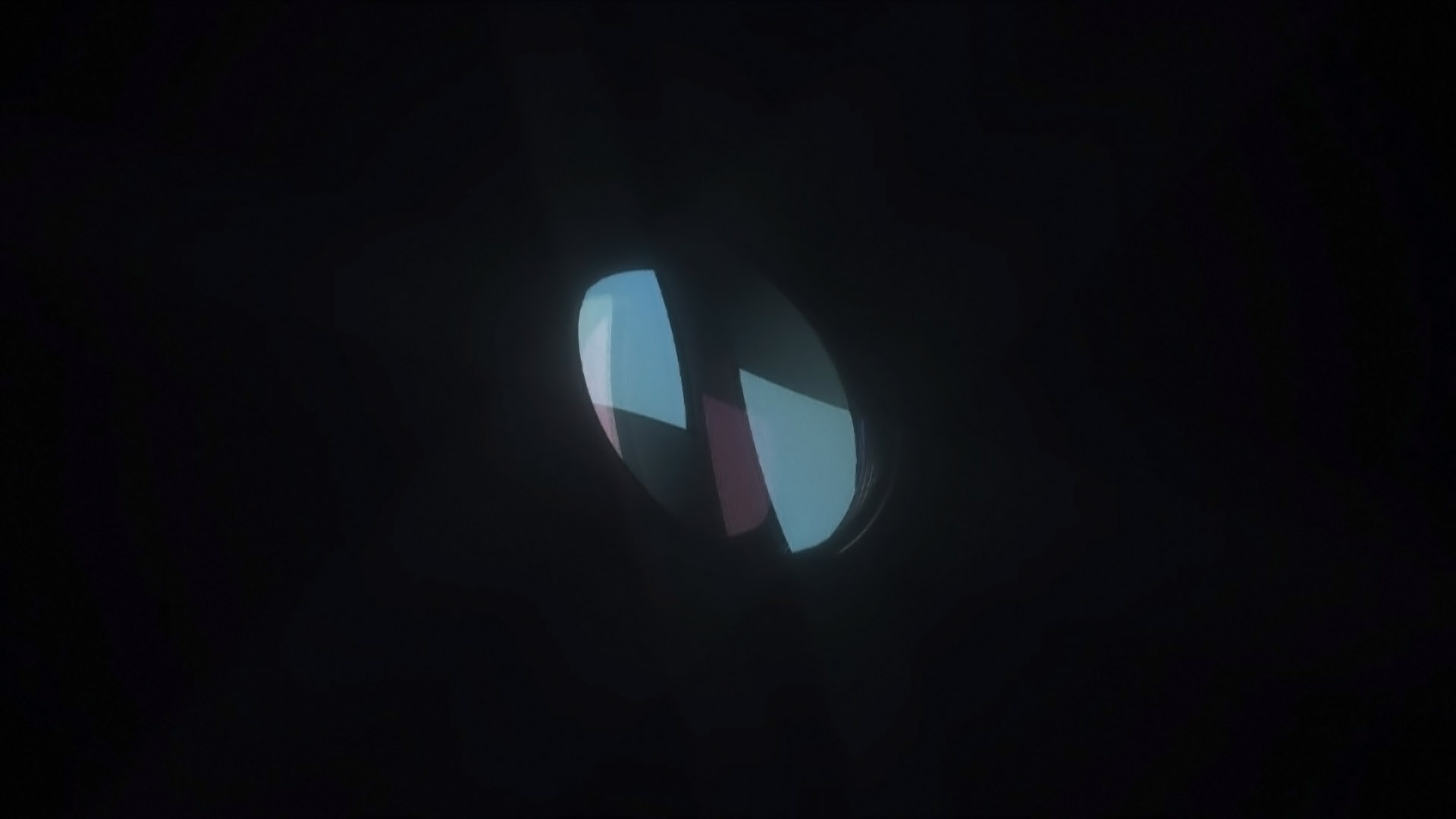
The visual language of the project is built on planes of the logo. They hint at the depth of space by delicately interacting with text, images and graphic objects placed between them. Planes work like super-graphics, but appear consciously and appropriately, without distracting from the essence of the content.
As a result, we designed the appearance for the system of the whole reality — not life-imitation, but one that build its own world with its own aesthetics and rules, allowing everyone to create and see more than is possible in real life.