Play
Attack
ATTACK Communication Agency (formerly A-TAK) was founded in 2008 to implement PR projects of venture capital funds, technology companies and IT startups. For 10 years the Agency has gained the trust of major Russian and international clients and received a number of professional awards. At the beginning of 2017, the founders of A-TAK were among the first to launch a direction for working with blockchain projects. By the decade, the Agency decided to take a bold step — to change the name and rebrand. The new name — ATTACK — retained its phonetic form, but made it understandable in the international market.
Original concept and art-direction by Segey Lavrinenko.
Logo lettering by Svetlana Turkina.
CG, motion design and layouts by me.
The skill of PR is in the perfect handling of information, in form of new values and meanings and with the help of words. Professional flair, knowledge of the technology market and the courage to go into new areas — these things are embedded in the DNA of the company through it's visual communications.
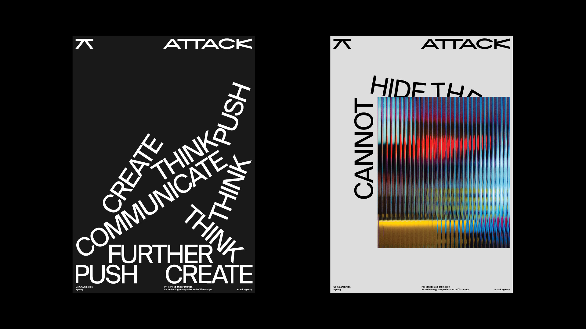
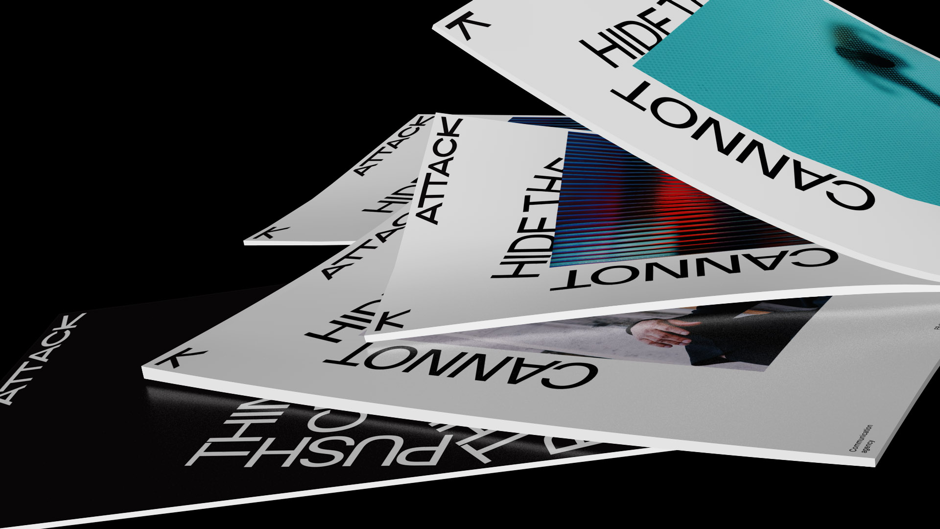
For all components of the identity we gave opportunity to Express itselves in their flexibility and variability of interaction with each other. Words come to life, they can fly, fall or play ping-pong — it reflects the courage and beyond expectations approach inherent in the nature of ATTACK. The use of images with narrative typography enhances the impression, and all in the complex — literally illustrate the work in the field of verbal communication.
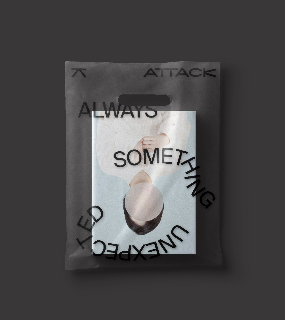
Identity, on the one hand, turned out to be fashionable and relevant, and on the other — shows the experience of the Agency and inspires confidence, playing on the contrast of modernity and traditions, style and technology.